Wet n Wild
When I first began at Wet n Wild I was primarily doing production artwork. Because a lot of our renders were so preliminary, some of the design process was revised during the production artwork process. Some took more time to creatively review than others.
The artwork below shows some of the collections I worked on both creatively and set up for mass production.
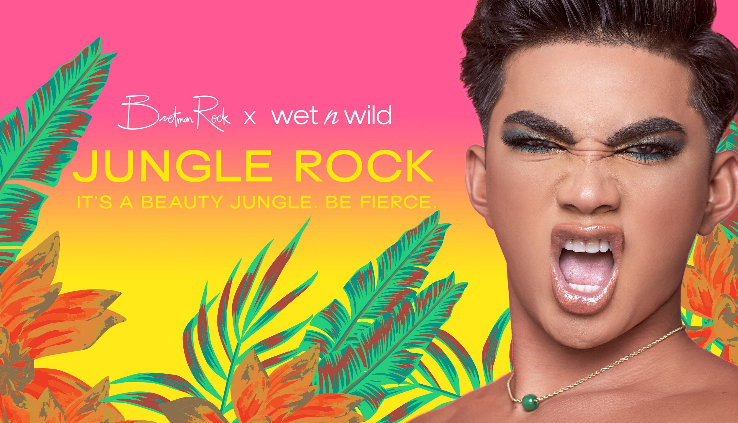


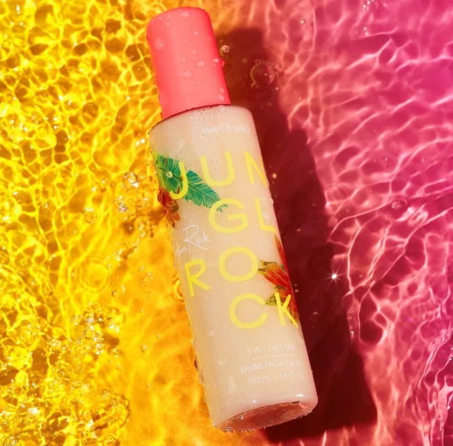
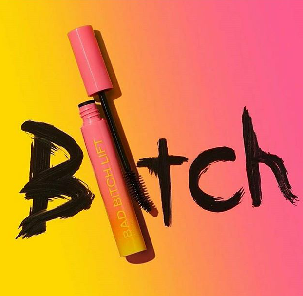

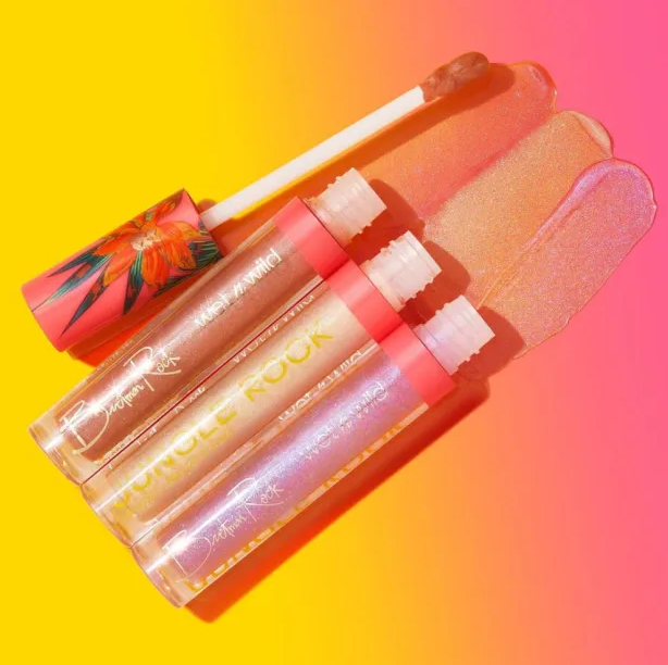
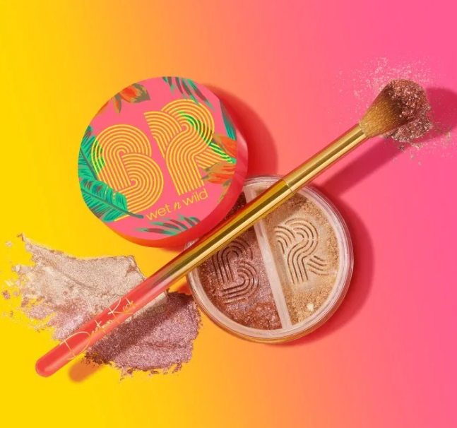
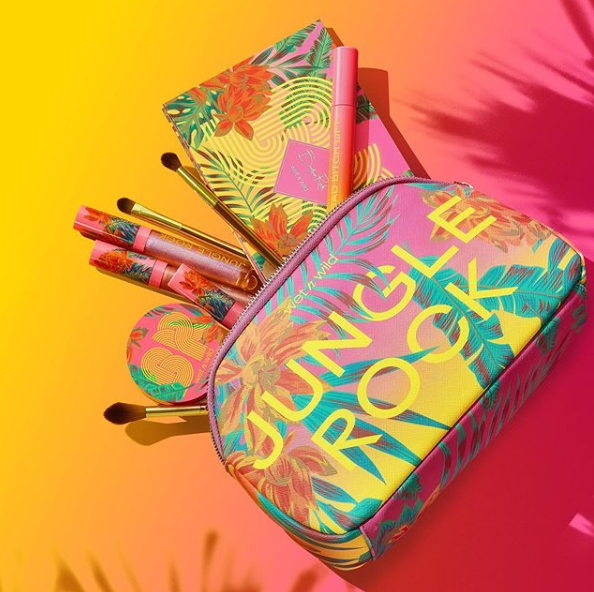
Wet n Wild X Bretman Rock
This vibrant collection used neon Pantones across all pieces of artwork. The vector artwork for the plants and flowers also used some metallic Pantones. The challenge with this artwork was making sure all vector artwork lined up perfectly. This was something I made sure to comb through so that there were no breaks in any of the connecting pieces. Overall, this was a fun collection to set up and see in stores. It really stands out.

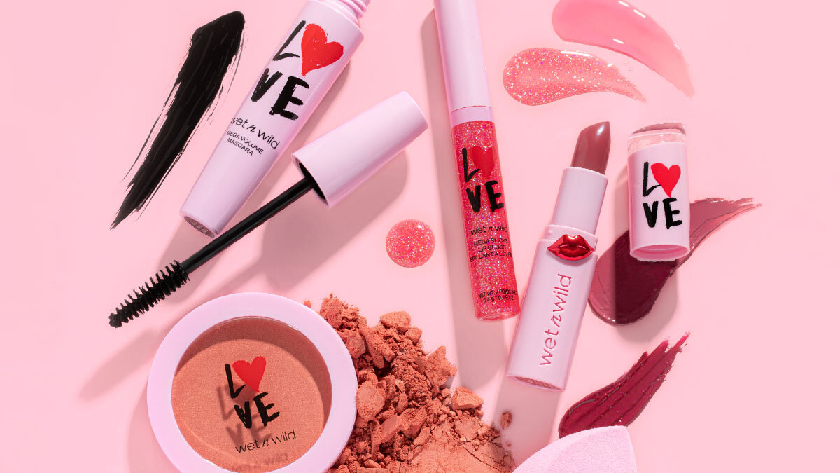
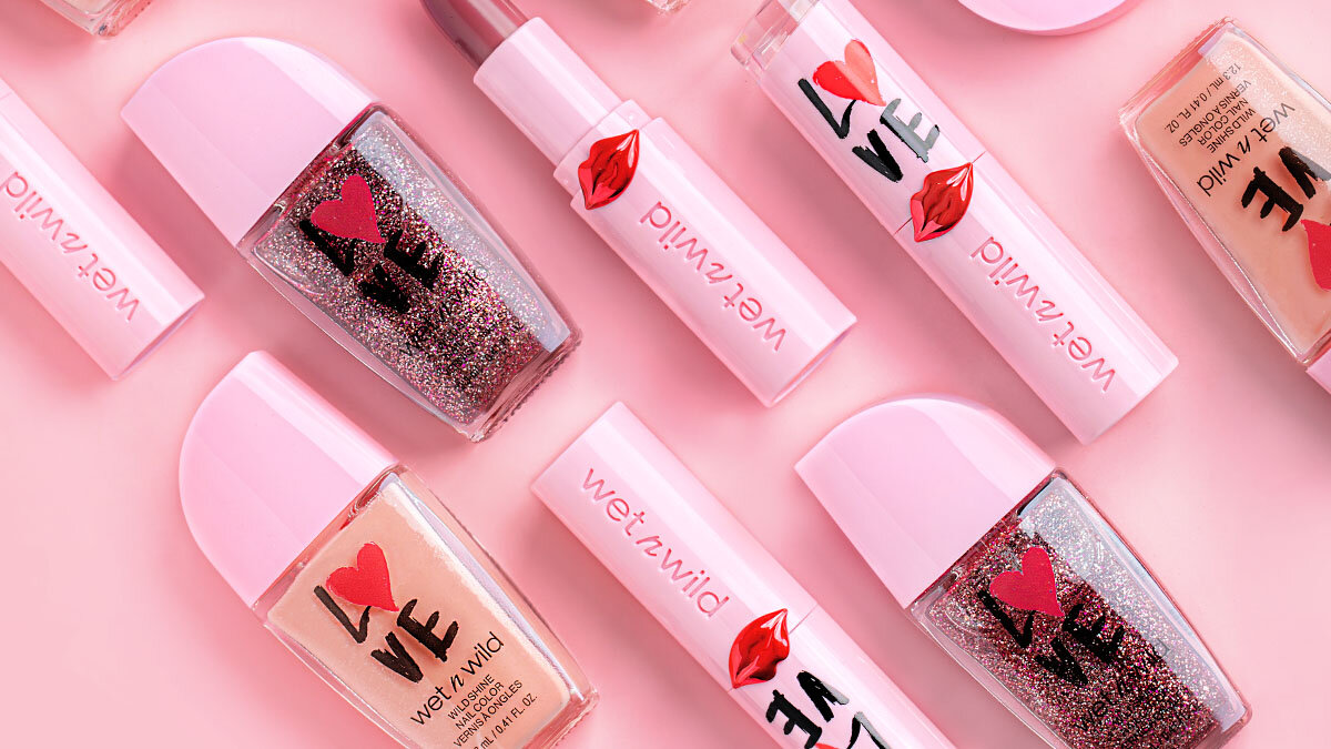

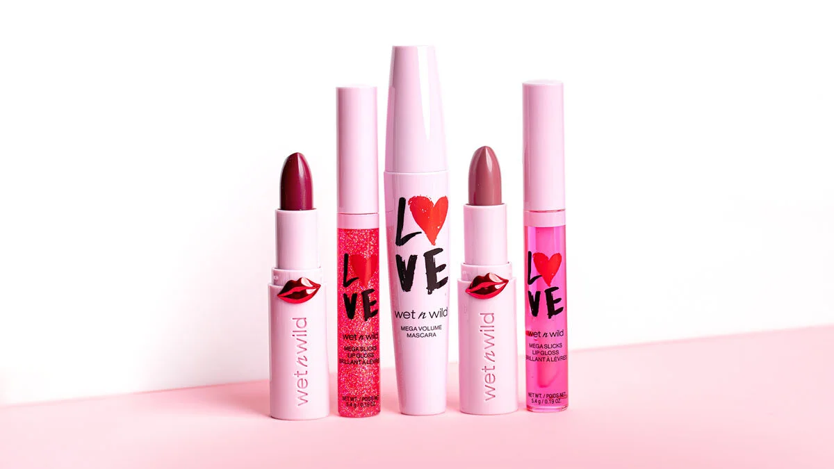

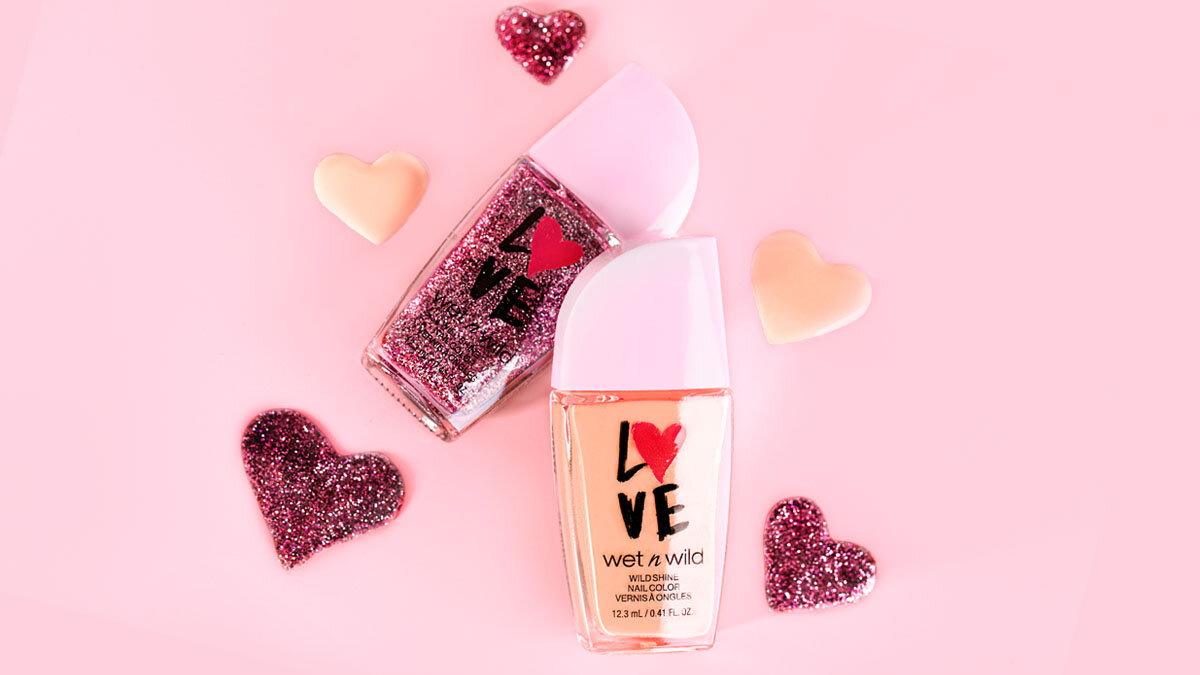

Wet n Wild Valentine’s Day Collection
Originally, these components were meant to be white, but with some push from our creative team we were able to get pink components which allowed us to keep the artwork minimal but bold. Wet n Wild has a variety of component shapes so I’m glad we were able to stick with one lay out of the “LOVE” artwork so that it looks consistent across all pieces.
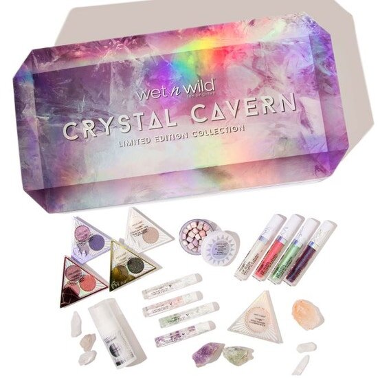


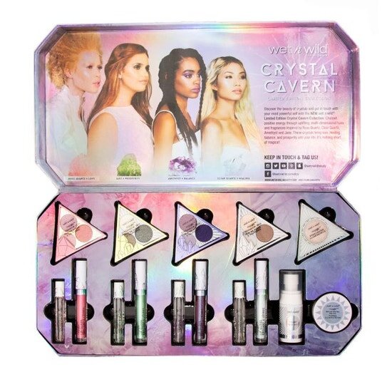


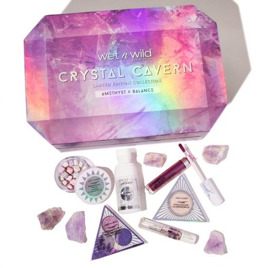

Wet n Wild Crystal Cavern Collection
This collection was a lot of fun to work on due to the intricacy of the patterns. The challenge here was to make each component have its own pattern that identifies to a type of crystal, but at the same time make the collection as a whole cohesive. I feel like we really nailed this! Each eyeshadow trio has it’s own unique crystal design as well as color. The square collection box needed to look like a crystal, so I added the gradient in the corners to give it the illusion of shape that isn’t there.


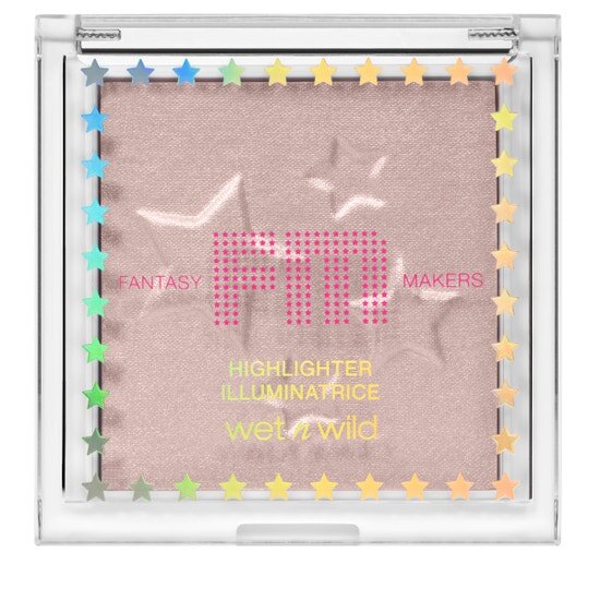


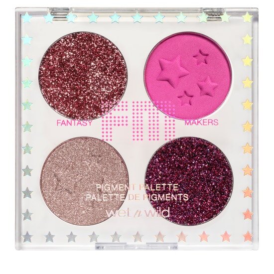


Fantasy Makers Festival
Fantasy Makers originally started as Halloween only themed. This time around we used Fantasy Makers brand to also include a music festival theme. A lot of the same aesthetic was used, but the components are white this time around. Some new products were also added so the star pattern had to be developed for those. The challenge here was to make sure the star pattern was consistent across all square, round, tube and palette products.